In today’s fast-paced digital landscape, capturing audience attention requires more than just well-written text. Infographics have emerged as a powerful tool for conveying complex information in a visually appealing and easily digestible format. By combining data, design, and storytelling, infographics can significantly boost engagement and shareability across various platforms. This comprehensive guide will explore the art and science of creating compelling infographics that not only inform but also captivate your audience.
Fundamentals of infographic design for viral content
Creating an infographic that has the potential to go viral requires a deep understanding of design principles, audience psychology, and content strategy. The key lies in striking the perfect balance between informative content and visually striking elements. A well-designed infographic should tell a story, guiding the viewer through data and insights in a logical and engaging manner.
To create a truly shareable infographic, focus on these fundamental aspects:
- Clear and concise messaging
- Striking visual hierarchy
- Effective use of color and typography
- Seamless integration of data and graphics
- Compelling narrative structure
Remember, the goal is to create something that not only informs but also resonates with your audience on an emotional level. This emotional connection is often the driving force behind viral content, encouraging viewers to share and engage with your infographic across various platforms.
Data visualization techniques for compelling infographics
At the heart of any effective infographic lies the art of data visualization. Transforming raw data into visually appealing and easily understandable graphics is crucial for capturing and maintaining audience attention. Let’s explore some key techniques for creating compelling data visualizations in your infographics.
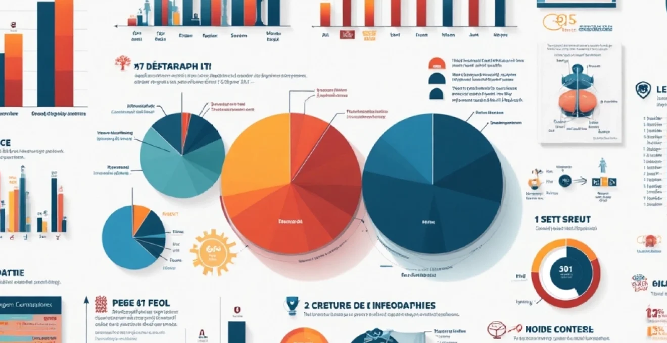
Choosing appropriate chart types: bar, line, pie, and scatter plots
Selecting the right chart type is essential for accurately representing your data. Each chart type serves a specific purpose and is suited to different types of information:
- Bar charts: Ideal for comparing values across categories
- Line charts: Perfect for showing trends over time
- Pie charts: Effective for displaying parts of a whole
- Scatter plots: Useful for showing relationships between variables
When choosing a chart type, consider the nature of your data and the story you want to tell. The right visualization can make complex information instantly understandable, while the wrong choice can lead to confusion or misinterpretation.
Color theory and palette selection for data clarity
Color plays a crucial role in infographic design, not just for aesthetic appeal but also for enhancing data clarity and comprehension. A well-chosen color palette can guide the viewer’s eye, highlight important information, and create a cohesive visual experience. Consider these principles when selecting colors:
- Use contrasting colors to differentiate between data points
- Employ a consistent color scheme throughout the infographic
- Leverage color psychology to evoke specific emotions or associations
- Ensure sufficient contrast for readability, especially for text elements
Remember, the goal is to use color strategically to enhance understanding, not to overwhelm or distract the viewer. A harmonious color palette can significantly improve the overall impact of your infographic.
Implementing gestalt principles in visual hierarchy
Gestalt principles of visual perception play a crucial role in creating effective infographic designs. These principles explain how humans naturally perceive and organize visual information. By leveraging these principles, you can create a clear visual hierarchy that guides the viewer through your infographic in a logical and intuitive manner.
Key Gestalt principles to consider in infographic design include:
- Proximity: Grouping related elements together
- Similarity: Using consistent styles for related information
- Continuity: Creating a natural flow of information
- Closure: Allowing the viewer’s mind to complete shapes or patterns
- Figure-ground: Clearly distinguishing between foreground and background elements
By skillfully applying these principles, you can create infographics that are not only visually appealing but also intuitively understandable , enhancing the overall user experience and information retention.
Integrating icons and illustrations for data storytelling
Icons and illustrations are powerful tools for enhancing data storytelling in infographics. They can simplify complex concepts, add visual interest, and create emotional connections with your audience. When integrating icons and illustrations:
1. Choose icons that are simple, recognizable, and relevant to your content
2. Use consistent style and size for icons throughout the infographic
3. Incorporate custom illustrations to bring unique data points or concepts to life
4. Ensure that icons and illustrations complement rather than compete with your data visualizations
The judicious use of these visual elements can significantly enhance the narrative of your infographic, making it more engaging and memorable for your audience.
Tools and software for professional infographic creation
Creating professional-quality infographics requires the right tools and software. From vector graphics editors to web-based platforms, there’s a wide range of options available to suit different skill levels and project requirements. Let’s explore some of the most popular and effective tools for infographic creation.
Vector graphics with adobe illustrator and inkscape
For designers seeking maximum control and flexibility, vector graphics editors like Adobe Illustrator and Inkscape are indispensable tools. These powerful software applications allow for precise control over every element of your infographic, from custom shapes to intricate illustrations.
Adobe Illustrator, part of the Adobe Creative Suite, is the industry standard for professional vector graphics creation. It offers a comprehensive set of tools for creating complex designs and supports seamless integration with other Adobe products. Inkscape, on the other hand, is a free, open-source alternative that provides many of the same capabilities as Illustrator, making it an excellent choice for those on a budget or just starting out in infographic design.
Key advantages of using vector graphics software include:
- Scalability without loss of quality
- Precise control over every design element
- Advanced typography options
- Ability to create custom illustrations and icons
While these tools have a steeper learning curve, they offer unparalleled flexibility for creating unique and professional infographics.
Web-based platforms: canva, piktochart, and venngage
For those seeking a more user-friendly approach to infographic creation, web-based platforms like Canva, Piktochart, and Venngage offer intuitive interfaces and a wealth of pre-designed templates. These tools are ideal for non-designers or those looking to create infographics quickly without sacrificing quality.
Canva, known for its ease of use, provides a drag-and-drop interface and a vast library of design elements. Piktochart offers a range of customizable templates specifically designed for infographics, while Venngage specializes in data visualization and business graphics.
Web-based platforms democratize infographic creation, allowing anyone to produce professional-looking designs without extensive graphic design experience.
These platforms typically offer:
- A wide selection of customizable templates
- Drag-and-drop interfaces for easy design
- Libraries of icons, images, and other design elements
- Collaboration features for team projects
- Easy export and sharing options
While they may not offer the same level of customization as vector graphics software, these web-based tools provide an excellent balance of ease of use and design quality.
Data-driven infographics using tableau and PowerBI
For infographics that require complex data visualization, tools like Tableau and PowerBI offer powerful capabilities. These platforms are designed specifically for data analysis and visualization, making them ideal for creating data-driven infographics.
Tableau is renowned for its ability to handle large datasets and create interactive visualizations. It offers a wide range of chart types and mapping capabilities, allowing users to create compelling data stories. PowerBI, developed by Microsoft, integrates seamlessly with other Microsoft products and provides robust data analysis and visualization features.
Key features of these data visualization tools include:
- Advanced data analysis capabilities
- Real-time data integration
- Interactive visualizations
- Customizable dashboards
- Collaboration and sharing options
While these tools require some knowledge of data analysis, they can be invaluable for creating infographics that tell powerful stories with complex datasets.
Collaborative design with figma and sketch
In today’s collaborative work environments, tools that facilitate team-based design are increasingly important. Figma and Sketch are two popular platforms that excel in this area, offering powerful design capabilities along with robust collaboration features.
Figma, a web-based design tool, allows multiple users to work on the same project simultaneously, making it ideal for team-based infographic creation. It offers a comprehensive set of design tools, including vector editing capabilities, and supports real-time collaboration.
Sketch, while primarily a desktop application for Mac, also offers cloud-based collaboration features. It’s known for its intuitive interface and extensive plugin ecosystem, which can extend its functionality for infographic creation.
Benefits of using collaborative design tools include:
- Real-time collaboration capabilities
- Version control and design history
- Seamless handoff between team members
- Integration with other design and prototyping tools
- Extensive libraries of design resources and templates
These tools bridge the gap between individual creativity and team collaboration, making them excellent choices for organizations looking to streamline their infographic design process.
Optimizing infographics for social media sharing
Creating a stunning infographic is only half the battle; ensuring it reaches and engages your target audience is equally crucial. Optimizing your infographics for social media sharing can significantly increase their visibility and impact. Let’s explore some key strategies for maximizing the shareability of your infographics across various social platforms.
Platform-specific size and format requirements
Each social media platform has its own unique requirements for image sizes and formats. To ensure your infographic looks its best across all platforms, it’s essential to create versions tailored to each one. Consider these guidelines:
| Platform | Optimal Image Size | Aspect Ratio |
|---|---|---|
| 1200 x 630 pixels | 1.91:1 | |
| 1080 x 1080 pixels | 1:1 (square) | |
| 1024 x 512 pixels | 2:1 | |
| 1104 x 736 pixels | 1.5:1 |
Remember to test your infographic on each platform to ensure it displays correctly and maintains its visual impact. You may need to create multiple versions or even break down a larger infographic into smaller, platform-specific pieces for optimal sharing.
Crafting engaging titles and captions for increased clicks
The title and caption of your infographic play a crucial role in attracting attention and encouraging clicks. To maximize engagement:
- Use clear, concise language that accurately describes the content
- Incorporate relevant keywords for improved searchability
- Highlight the value or unique insight your infographic provides
- Ask questions or use intriguing statements to pique curiosity
- Include a call-to-action encouraging users to share or learn more
Remember, your title and caption are often the first (and sometimes only) things users see when scrolling through their feeds. Make them count by crafting compelling, value-driven text that entices users to engage with your content.
Implementing alt text and accessibility features
Accessibility is not just a best practice; it’s essential for reaching a wider audience and improving your content’s SEO performance. When sharing infographics on social media, be sure to implement these accessibility features:
- Add descriptive alt text to your images
- Use high contrast colors for better readability
- Ensure text is large enough to be easily read on mobile devices
- Provide a text-based version of the infographic content when possible
By making your infographics accessible, you not only expand your potential audience but also demonstrate a commitment to inclusivity that can enhance your brand’s reputation.
Leveraging pinterest rich pins for infographic distribution
Pinterest is an excellent platform for sharing infographics due to its visual nature and long content lifespan. To maximize your infographic’s reach on Pinterest, leverage Rich Pins. These enhanced pins provide more context about your infographic directly on the pin itself, increasing engagement and click-through rates.
To use Rich Pins effectively:
- Ensure your website is set up for Rich Pins and verified by Pinterest
- Use high-quality, vertical images optimized for Pinterest’s layout
- Include detailed descriptions with relevant keywords
- Add your logo or branding to the infographic for increased brand visibility
- Utilize Pinterest’s board and section features to organize your infographics thematically
By optimizing your infographics for Pinterest, you can tap into a highly engaged audience and extend the lifespan of your content well beyond its initial publication.
Measuring and analyzing infographic performance
Creating stunning infographics is only part of the equation; to truly maximize their impact, you need to measure and analyze their performance. This data-driven approach allows you to refine your strategies and create even more effective infographics in the future. Let’s explore the key metrics and methods for evaluating infographic success.
Key metrics: shares, engagement, and backlinks
When assessing the performance of your infographics, focus on these critical metrics:
- Shares: The number of times your infographic has been shared across various platforms
- Engagement: Likes, comments, and other interactions on social media posts featuring your infographic
- Backlinks: The number of websites linking to your infographic or the page it’s hosted on
- Traffic: The amount of website traffic generated by the infographic
- Time on page: How long users spend viewing the infographic on your site
These metrics provide valuable insights into how well your infographic resonates with your audience and its overall reach. High shares and engagement rates indicate that your content is striking a chord with viewers, while a large number of backlinks suggests that other websites find your infographic valuable and authoritative.
A/B testing infographic designs for optimization
To continuously improve your infographic performance, consider implementing A/B testing. This involves creating two versions of an infographic with slight variations
and comparing their performance. This method allows you to identify which design elements, color schemes, or layouts are most effective in engaging your audience.
When conducting A/B tests for infographics:
- Test one variable at a time (e.g., color scheme, layout, or typography)
- Use a large enough sample size to ensure statistical significance
- Set clear goals for what you want to improve (e.g., shares, time on page, or click-through rates)
- Use tools like Google Optimize or Optimizely to run your tests
By systematically testing and refining your infographic designs, you can continually improve their performance and impact over time.
Using google analytics to track infographic traffic
Google Analytics is a powerful tool for tracking and analyzing the performance of your infographics. By properly setting up Google Analytics, you can gain valuable insights into how users interact with your infographic content. Here’s how to effectively use Google Analytics for infographic tracking:
- Set up custom UTM parameters for your infographic URLs to track their performance across different channels
- Create goals in Google Analytics to measure specific actions, such as time spent viewing the infographic or clicks on embedded links
- Use the Behavior Flow report to understand how users navigate to and from your infographic
- Analyze the Audience reports to gain insights into the demographics and interests of users who engage with your infographics
- Utilize the Site Content report to compare the performance of different infographics on your site
By leveraging these Google Analytics features, you can gain a comprehensive understanding of your infographic’s performance and make data-driven decisions to improve future designs.